

Rapidly build modern websites without ever leaving your HTML.
A utility-first CSS framework packed with classes like flex, pt-4, text-center and rotate-90 that can be composed to build any design, directly in your markup.
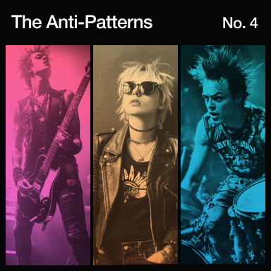
    <div class="flex flex-col items-center gap-6 p-7 rounded-2xl">
        <div>
            <img class="size-48 shadow-xl rounded-md"/>
        </div>
        <div class="flex items-center">
            <span class="text-2xl font-medium">Class Warfare</span>
            <span class="font-medium text-sky-500">The Anti-Patterns</span>
            <span class="flex gap-2 font-medium text-gray-600 dark:text-gray-400">
                <span>No. 4</span>
                <span>.</span>
                <span>2025</span>
            </span>
        </div>
    </div>
Sponsors
Supported by the best.
Tailwind is supported by incredible partners and sponsors who make it possible for a team of talented designers and engineers to maintain the framework full-time.
Why Tailwind CSS?
Built for the modern web.
Tailwind is unapologetically modern, and takes advantage of all the latest and greatest CSS features to make the developer experience as enjoyable as possible.
Responsive design
Okay, it’s not exactly cutting edge, but just throw a screen size in front of literally any utility to apply it at a specific breakpoint.
Filters
What’s a website these days without a few backdrop blurs? Keep stacking filters until your designer asks you to please, please stop.
Dark mode
If you’re not a fan of burning your retinas, just stick dark: in front of any color to apply it in dark mode.
CSS variables
Customizing your theme is as simple as creating a few CSS variables.
P3 colors
The color palette now uses more vibrant wide gamut colors without you needing to understand what any of that even means.
CSS grid layout
Using grid utilities directly in your HTML makes it so much easier to reason about complex layouts.
Transitions and animations
Transitions that work the way you'd expect — throw a few utilities on an element and you're in business.
Cascade layers
Tailwind uses CSS layers so you don’t have to worry about specificity issues.
Logical properties
Supporting multiple language text directions is no longer a nightmare.
Container queries
Tag an element as a container to let children adapt to changes in its size.
Gradients
No need to remember that complicated gradient syntax — create silky-smooth gradients with just a few utility classes.
3D transforms
Sometimes two dimensions aren’t enough. Scale, rotate, and translate any element in 3D space to add a touch of depth.
How it works
Ship faster and smaller.
Tailwind automatically removes all unused CSS when building for production, which means your final CSS bundle is the smallest it could possibly be. In fact, most Tailwind projects ship less than 10kB of CSS to the client.
<!DOCTYPE html>
<html lang="en">
<head>
<meta charset="UTF-8" />
<meta name="viewport" content="width=device-width, initial-scale=1.0" />
<title>Tailwind CSS</title>
<link rel="stylesheet" href="/build.css" />
</head>
<body>
<button class="flex items-center bg-blue-500 px-4 py-3 text-white hover:bg-blue-400"></button>
</body>
</html>
.px-4 {
padding-inline: calc(var(--spacing, 0.25rem) * 4);
}
.py-3 {
padding-block: calc(var(--spacing, 0.25rem) * 3);
}
.text-white {
color: var(--color-white, #fff);
}
.hover\:bg-blue-400 {
&:hover {
@media (hover: hover) {
background-color: var(--color-blue-400, oklch(70.7%
0.165 254.624));
}
}
}
}
Tailwind in the wild
Build whatever you want, without touching your CSS file.
Because Tailwind is so low-level, it never encourages you to design the same site twice. Some of your favorite sites are built with Tailwind, and you probably had no idea.


